Since the end of January, I’ve been working part-time for James Baker and Rossitza Atanassova, joining the end of the project titled “Legacies of Catalogue Descriptions and Curatorial Voice: Opportunities for Digital Scholarship.” The project has researched ways in which computational methods could shed light on how historical points of view were transmitted over time through different institutions’ catalogs with descriptions of items from the same collection. Specifically, the project used volumes 5 to 11 of the “Catalogue of Political and Personal Satires Preserved in the Department of Prints and Drawings in the British Museum.” Mary Dorothy George wrote the Catalogue’s descriptions between 1930 and 1954 for the British Museum. Years later, the Lewis Walpole Library and the British Library used the Catalogue as the basis for their own descriptions of select prints from the collection George had described.
The Legacies of Catalogue Descriptions project had been envisioned as an opportunity to encourage in-person collaboration between team members the UK and US, but due to the COVID-19 pandemic, the collaboration shifted to an online format. After the project’s deadline had been extended due to the pandemic, it would be coming to a close in early March 2022. James contacted me several months prior to ask if I’d be interested in creating an infographic that summarized the project’s findings, as something visual and printable to wrap up a project that had ended up being much more screen-based than initially envisioned. Excited at the opportunity to gain insight on a project investigating a similar area of research as my PhD (which is about gender bias in the language of catalogue descriptions), I took on the work.
To begin, I familiarized myself with the project outputs thus far. James, Rossitza, and their team had put together a collection of 21 statements summarizing the project findings; James had written a blog about a machine learning experiment with George’s Catalogue descriptions; and the team had published papers about corpus linguistics analysis of the descriptions and about the transmission of George’s curatorial voice from one institution’s catalog to another. Next, I arranged the 21 statements into different groupings, finally settling on two: one topical and one chronological.
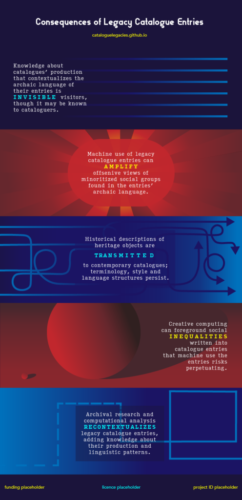
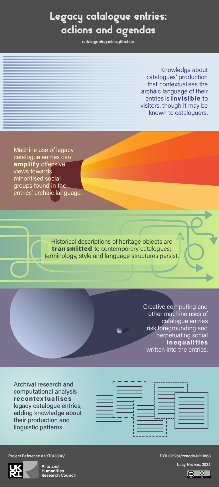
In the topical grouping, four main ideas stood out:
- The transmission of a historical cataloger’s point of view through the reuse of descriptions that cataloger wrote
- Contextual information about the context in which catalog descriptions were produced that those currently managing a collection may know but that visitors to the catalog and collection often do not know
- The ability of versioning systems and new cataloging practices to communicate such contextual information explicitly so visitors become aware of it
- The dual potential of computational methods to mitigate and reinforce power imbalances among social groups reflected in catalog descriptions
In the chronological grouping, three main steps stood out:
- The initial writing of the Catalogue’s descriptions by Mary Dorothy George
- The complementary methods of archival research and computational analysis being applied to catalog descriptions, revealing the influence of George on present-day catalogs and generating new knowledge about the word choice and language structure in catalog descriptions
- The enhancement of a catalog that the knowledge from step 2 enables, as it can guide catalogers’ redescription efforts
Overlayed across these three steps is first idea from the topical grouping: the transmission of a historical point of view. This transmission is important for both groupings because the historical point of view comes through in outdated and offensive language used to describe different groups of people, which does not reflect the language catalogers would use today if writing the descriptions for the first time.

I created two sketches of infographics based on these two groupings to see which resonated with James and the project team best. For the topical grouping, I designed independent visual representations of five statements that communicated the main ideas I’d pulled out from the 21 statements. For the chronological grouping, I designed a flow diagram representing the steps of the project. We decided to move forward with both infographics as they expressed complementary summaries of the project, so I iterated further on their visual design and copy.
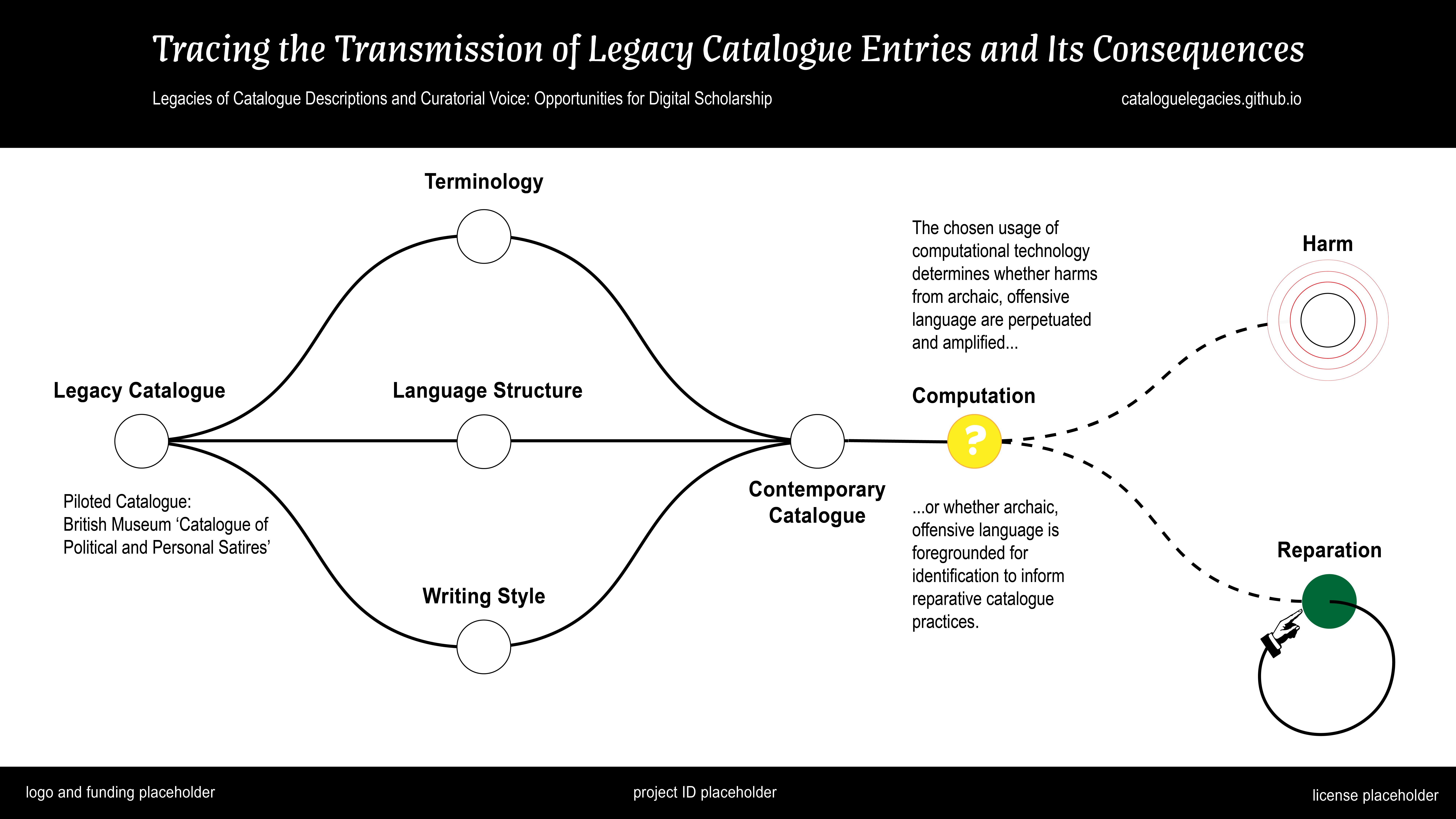
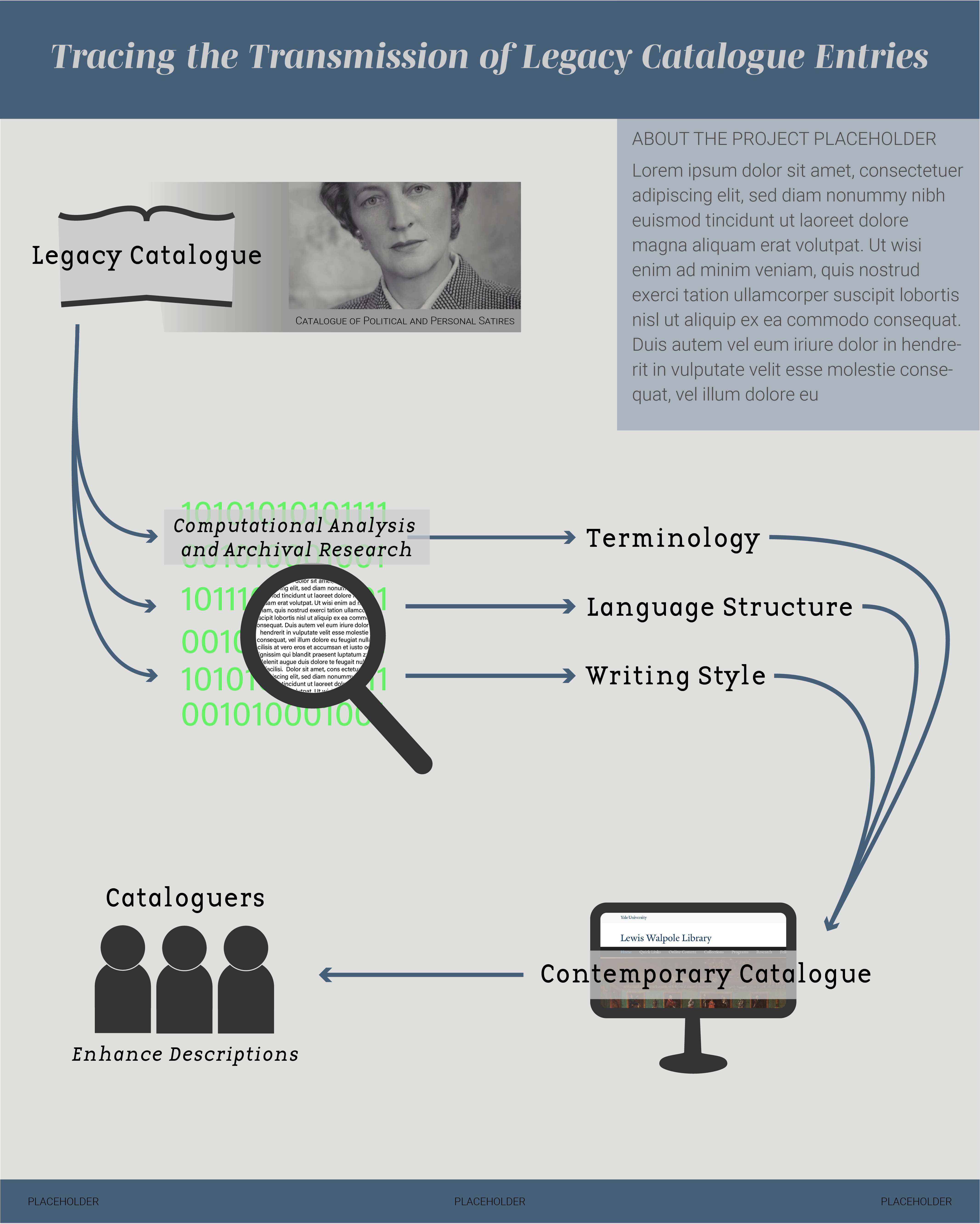
Image credit: Howard Coster, National Portrait Gallery
To guide my revisions to the infographics, I attended two project workshops and received feedback from members of the project team in the UK and the US. Changes to the terms I’d highlighted in the topical infographic altered the message of one statement and refined the message of another. Overall, the revisions to the topical infographic were focused on the visual design more than the messages it communicated, though.Changes to the chronological infographic were more substantial. I hadn’t been entirely satisfied with the flow diagram layout and the feedback reinforced my feeling that this wasn’t a suitable layout for communicating the transmission of legacy catalog descriptions over time. The flow diagram was too literal. It failed to represent the role of people throughout each step, instead emphasizing them only at the end. It also failed to demonstrate how interdisciplinary methods (such as those applied in this “Legacies” project) could facilitate the enhancement of a catalog. So I started over.
Browsing through the work of designers and agencies I like online, I came across work by Giorgia Lupi and Pentagram (this, this, and this) that inspired a metaphor for me to design around: lenses. Even if the voice of the original cataloger to describe a collection gets transmitted over time, there are other factors that also come to influence the descriptions in a catalog as time passes. For example, the process of moving from a physical, codex catalog to a digital, database catalog; and the acquisition of cataloged items by new institutions that get re-described for those institutions’ catalogs. I decided to represent the perspective on the world that these influences provide as lenses.
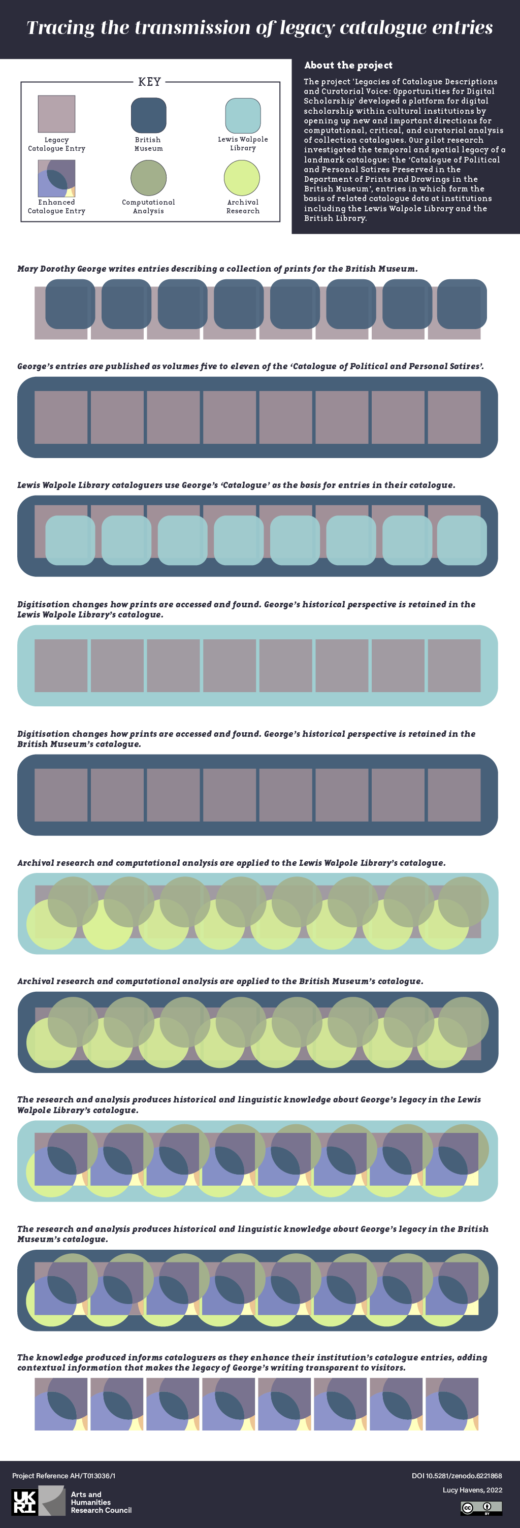
I visualized the lenses as slightly transparent shapes with a different color for each influencing factor. George’s lens for the British Museum is dark blue and the Lewis Walpole Library catalogers’ lens is aqua; both are represented as the same shape, a rounded rectangle, as both are associated with a memory institution involved in the project. The lens of an archival researcher is represented in green and the lens of a computational analysis researcher is represented in pale yellow; both are the same shape, a circle as both are associated with research methods applied to the Catalogue. The gray squares representing catalog descriptions become layered with color as these lenses are applied to the catalogs over time. The resulting multi-colored descriptions represent the enhancement of the catalog that comes from making contextual information about its production transparent to visitors.
If you’d like to receive a high-resolution version of these infographics, contact Lucy or James! The infographics are licensed under Creative Commons Attribution 4.0 International License. Small file sizes of the infographics are located at DOI 10.5281/zenodo.6221868.
Thanks go to the Arts and Humanities Research Council (UK) for funding the creation of these infographics under the “UK-US Collaboration for Digital Scholarship in Cultural Institutions: Partnership Development Grants” scheme.
Leave a Reply