This is the second post in a series of blogs about data visualizations of PA-X, a database of peace agreements created by the Political Settlements Research Programme at the University of Edinburgh. This blog was originally published on the PA-X Visualization project website.
With the PA-X timeline nearly complete, I’ve decided to reflect on how well it embodies the characteristics the PSRP team and I identified as key to the PA-X data visualizations. These characteristics are extensible, customizable, and shareable.
Extensible: the timeline can accommodate new data without significant changes to the code files I’ve written. If PSRP adds peace agreements to PA-X, up to three changes will need to be made:
(1) Change the data source file to the newly exported CSV file.
(2) Add the new years to the start year and end year drop down lists on the left-hand side of the visualization webpage (if the new CSV file contains agreements that are signed before 1990 or after 2015).
(3) Add the new country and entity names to the two country/entity drop down lists on the left-hand side of the visualization webpage (if the new CSV file contains agreements that were signed by new countries or entities).
The timelines’ axes, the count and proportion calculations, and the size of the timeline visualizations are determined by the data source file, so those will adjust to new data automatically.
Customizable: Thanks to the PSRP team’s continuous feedback this summer , I’ve created dynamic timelines that are responsive to end-user (i.e. political settlements researchers, peace process participants) needs. The filters and color coding of the timelines visualize categories relevant to current PSRP research: human rights, gender, transitional justice, power sharing, political institutions, and agreement stage. The metrics visualized on the timelines are consistent with metrics PSRP researchers use to analyze peace processes: daily and yearly agreement totals, and yearly proportions of agreements that address selected codes. Users can choose to visualize categories individually or in combination, enabling comparisons or aggregations of data across time, location, and category.
Shareable: This characteristic is still in the works. Data visualizations created with D3.js (the JavaScript library I’m using) can be exported as a static graphic, so I’ll soon implement an export feature. The timeline will live on a webpage, so users will also be able to share the dynamic visualizations as URLs.
What began as a single PA-X timeline has actually become multiple PA-X timelines: one oriented horizontally and three oriented vertically. The horizontal timeline supports the analysis of trends in peace agreements.

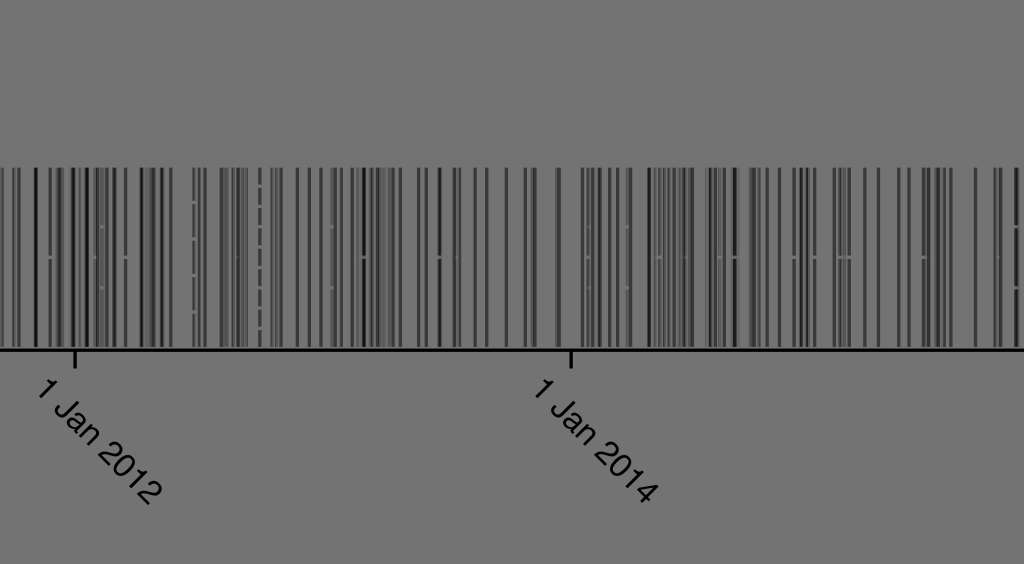
Users can filter the agreements it visualizes by time, location and category. For the location and category filters, users can choose to view any agreement that addresses at least one of the filters they’ve selected, or only agreements that address all filters they’ve selected.

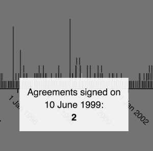
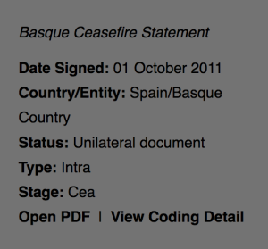
The horizontal timeline groups agreements by day and year. With the daily grouping, users can hover over each agreement to view its core information, or hover over a daily group to see the total count of agreements signed on that day.

With the yearly grouping, users can hover over each agreement to view its core information, view the total count of agreements signed each year, or view the proportion of agreements each year that address the codes they’ve selected.


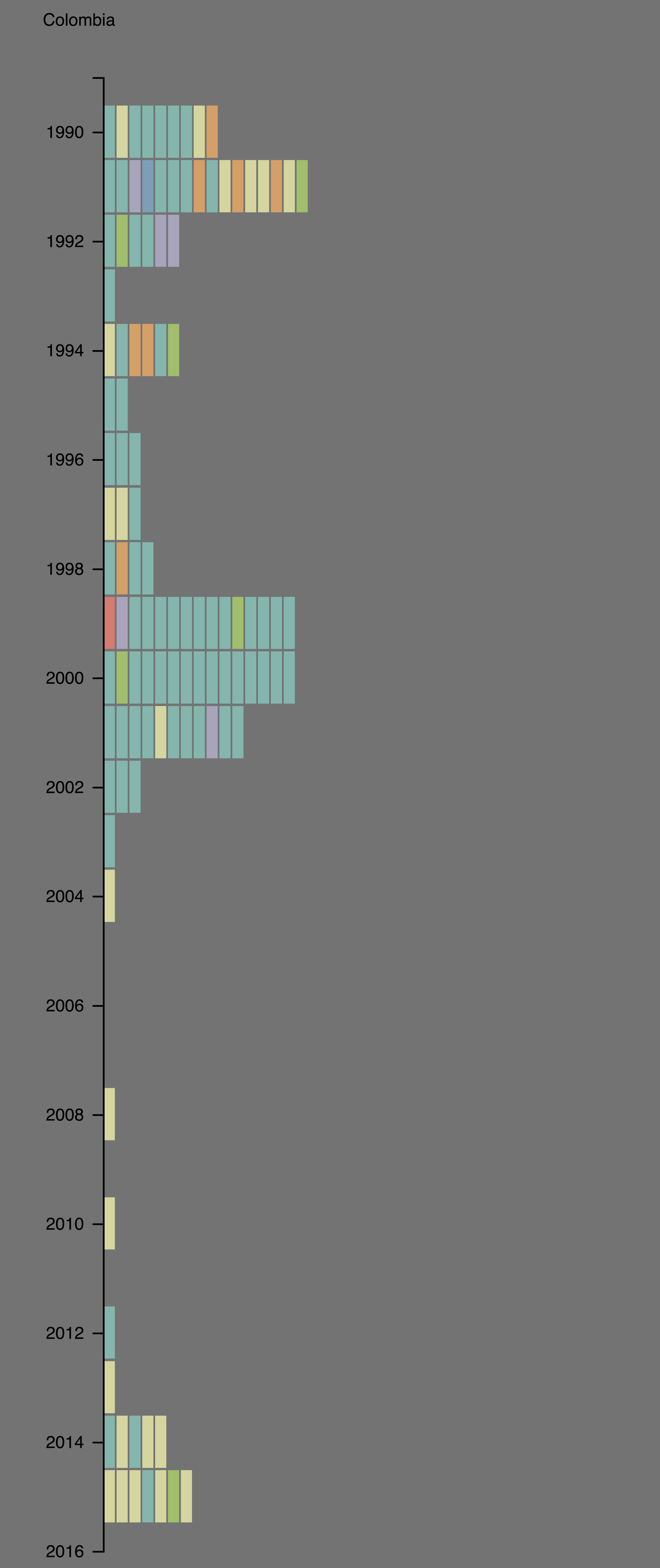
The vertical timelines supports the comparative analysis of peace agreements across different locations. Users can select one location to view per vertical timeline, all three of which users can filter by the same categories as the horizontal timeline. Additionally, the vertical timelines color-code the agreements by stage.
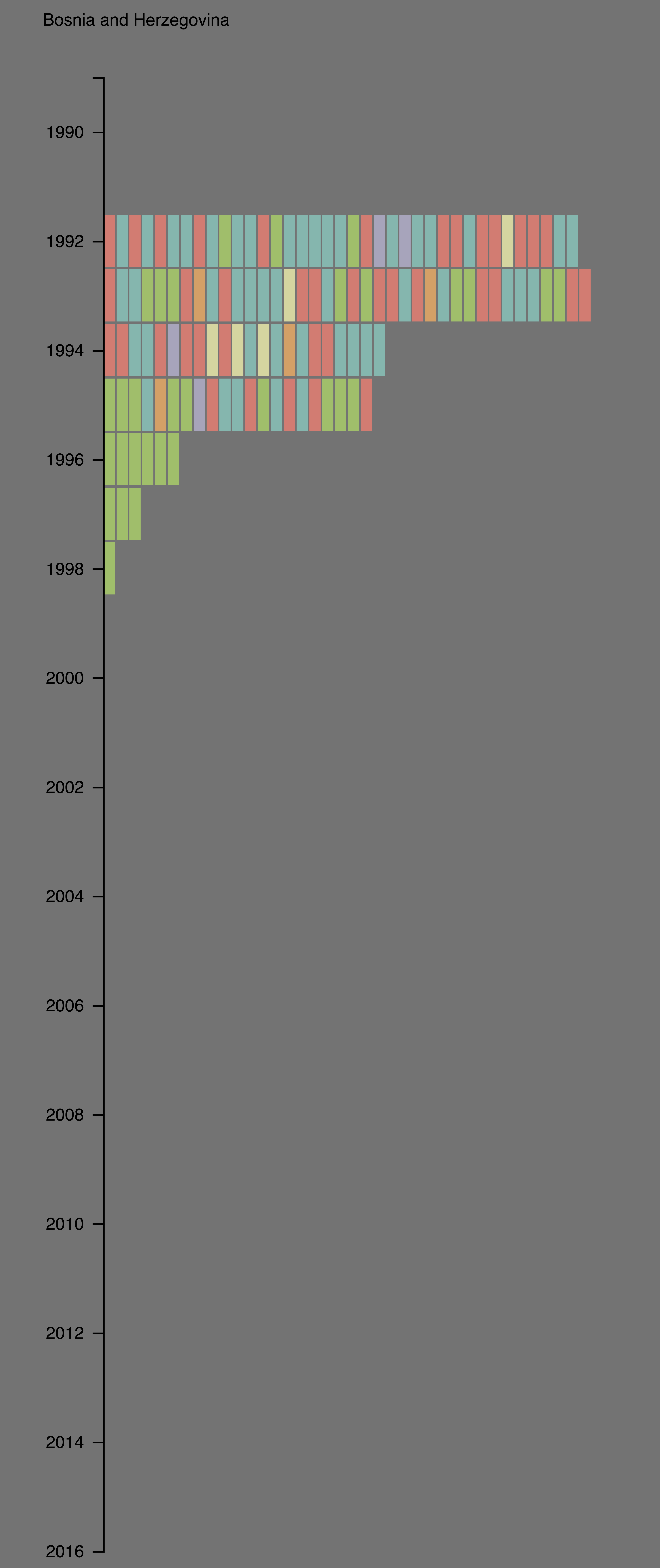
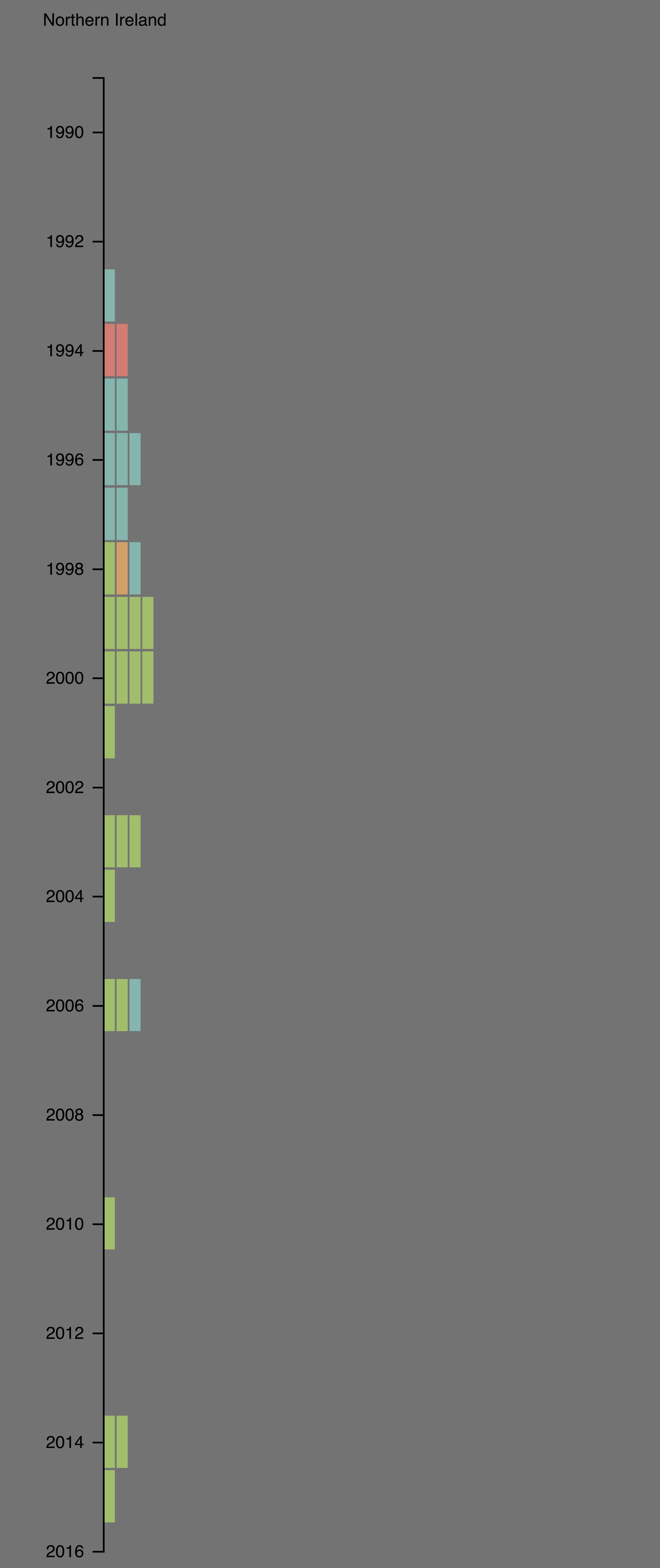

As the final step to my summer’s data visualization work with PA-X, I’ll integrate the timeline visualizations with a map visualization that Mengting Bao created. The map visualizes the geographic distribution of agreements: the map has a symbol for each agreement on the country that signed the agreement. Each agreement’s symbol is a flower with eight petals (one petal for each code the PSRP team asked us to visualize). Once the timeline and map visualizations are integrated, a user will be able to hover over an agreement on the horizontal timeline or on the map to see its details in the left sidebar. Users will be able to filter the map using the same time, location, and category filters as the horizontal timeline.
In my next post I’ll summarize the complete PA-X visualization webpage, timelines + map!
Leave a Reply