This summer the University of Edinburgh’s Political Settlements Research Programme (PSRP) hired me to visualize their database of peace agreements, PA-X. Similar to many organizations with large amounts of data (such as Google, the World Health Organization, and the Library of Congress), PSRP recognizes the value of data visualization in research as twofold: visualization facilitates data analysis and communication of findings. The best data visualizations are online and interactive (see Rosenkranz and Jaillon), because anyone with an Internet connection can become a researcher and explore the data.
For the PA-X visualization project, I’m creating a timeline. The timeline will work in tandem with a map that a fellow University student of mine is creating. These data visualizations will offer a visual platform for researching peace agreements by location, time, and category (for a full list of the categories PSRP coded, check out the PA-X Codebook). PA-X contains 1,518 agreements from all over the world, spanning 26 years (1900 through 2015). Currently, you can search all of the agreements using search bars and drop down menus at peaceagreements.org/search.
If you’re only interested in seeing the results of my visualization process so far, you can skip to the “Visualizations” section. If you’re interested in hearing about the approach to creating the visualizations, read on!
APPROACH
PSRP will grow PA-X indefinitely. New agreements, codes, and data types may be added to the database. PA-X can also be combined with other data sources (PSRP uses UCDP conflict codes in PA-X for this purpose). With all of this in mind, I identified three key characteristics for the PA-X Timeline:
- Extensible: the Timeline should accommodate new data
- Customizable: the Timeline should offer many views to meet users’ diverse research questions
- Shareable: the Timeline should enable visual communication (at conferences, in publications, on Twitter, etc.)
To begin creating the Timeline, I drew on my design, software development, and customer experience skills.
First, following my habitual design process, I read and sketched. I read publications about political settlements and notes from my past studies of conflict resolution. In between reading sessions, I sketched with pen and paper, and then with Python and Adobe Illustrator. I sketched small, considering different manners of representing a single agreement, and I sketched big, considering different manners of representing an entire 26-year timeline of agreements. I explored the edge cases (or “extremes,” to borrow one of IDEO’s design thinking terms) of PA-X, focusing on the most complex and on the simplest entities in the database. Using agreements as a metric, “Colombia” and “Yugoslavia (former)” are the most complex; “Northern Ireland,” the simplest.
As any software developer must, I sought to create a timeline that allowed for future uses unimaginable to me. I limited my color palette, allowed for multiple dimensions of data to be viewed simultaneously, and wrote a dictionary of visual elements and patterns for the Timeline. I also confirmed the reliability of the data source: PSRP plants to update PA-X every six months or so, with a new CSV file available for export and visualization after each update.
Additionally, I met with the PA-X visualization project team and PSRP researchers. With the help of many sketches and existing online data visualizations, we determined the purpose of the PA-X Timeline: visualize (1) trends in peace agreements and (2) the chronology of peace agreements, and for both (1) and (2) enable (A) data analysis and (B) communication of findings.
VISUALIZATIONS
While working as a business and technology consultant, I witnessed the benefits of a crawl-walk-run approach (incidentally the Wright brothers also took this approach to inventing the first airplane, which I’ve recently learned while reading David McCullough’s book on the topic). For the PA-X visualization project, this translates to static-dynamic-integrated. Static visualizations let me focus on getting the visual appearance of the data right. From there I’ll move to dynamic visualizations, focusing on the transitions between different views of the data. Lastly I’ll focus on integrating external data sources into the PA-X Timeline.
The static visualizations of all agreements that I created illustrate a gradual upward trend in agreements addressing Gender. PSRP’s coding of Gender includes text that addresses topics of women, girls, men, boys, family, and sexual orientation, in addition to gender in general.

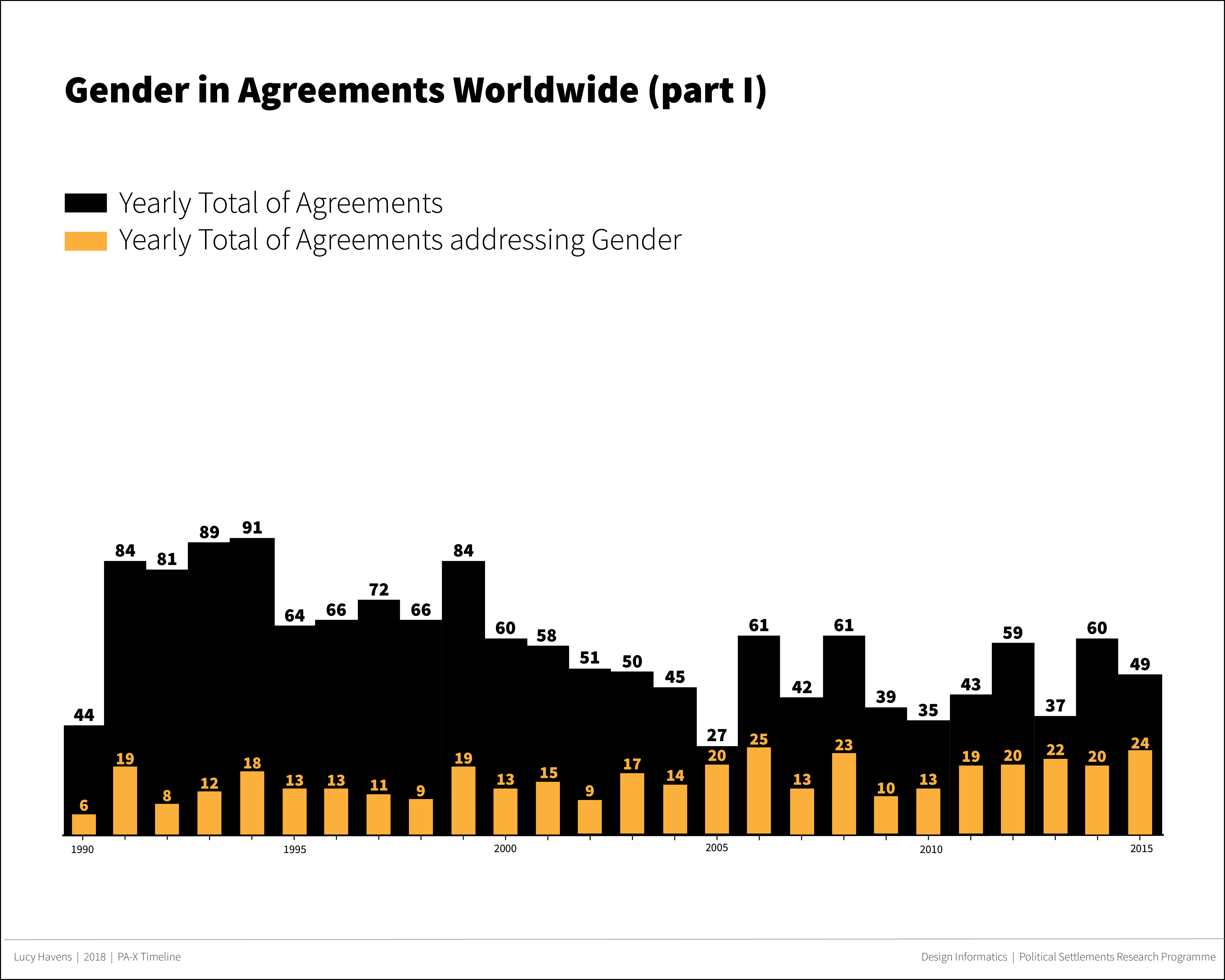
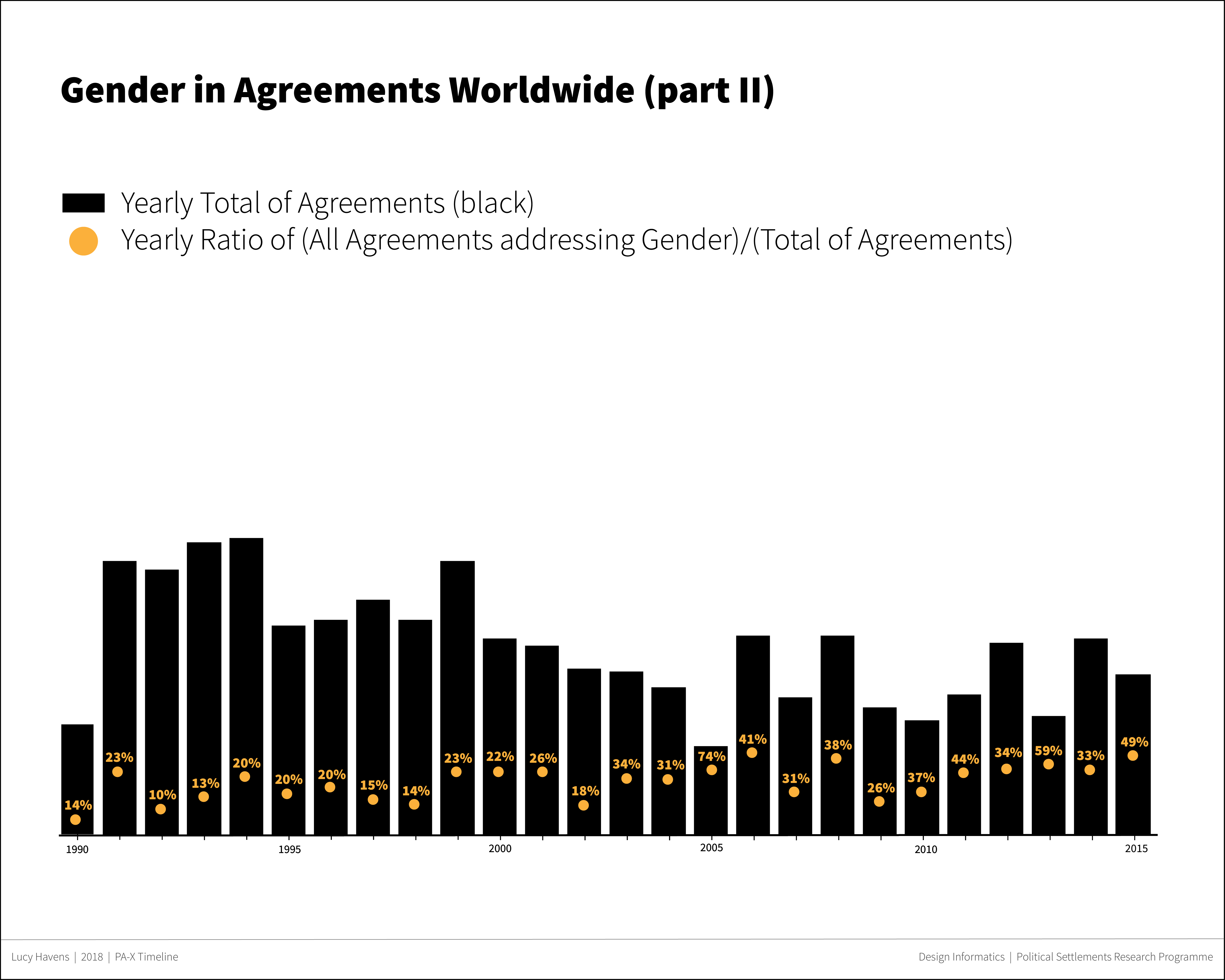

(As a main research theme of PSRP’s, I’ve prioritized visualizing Gender on the PA-X Timeline above other categories.)
The static visualizations of agreements within individual countries and entities that I created illustrate the complexity of the political settlement process.
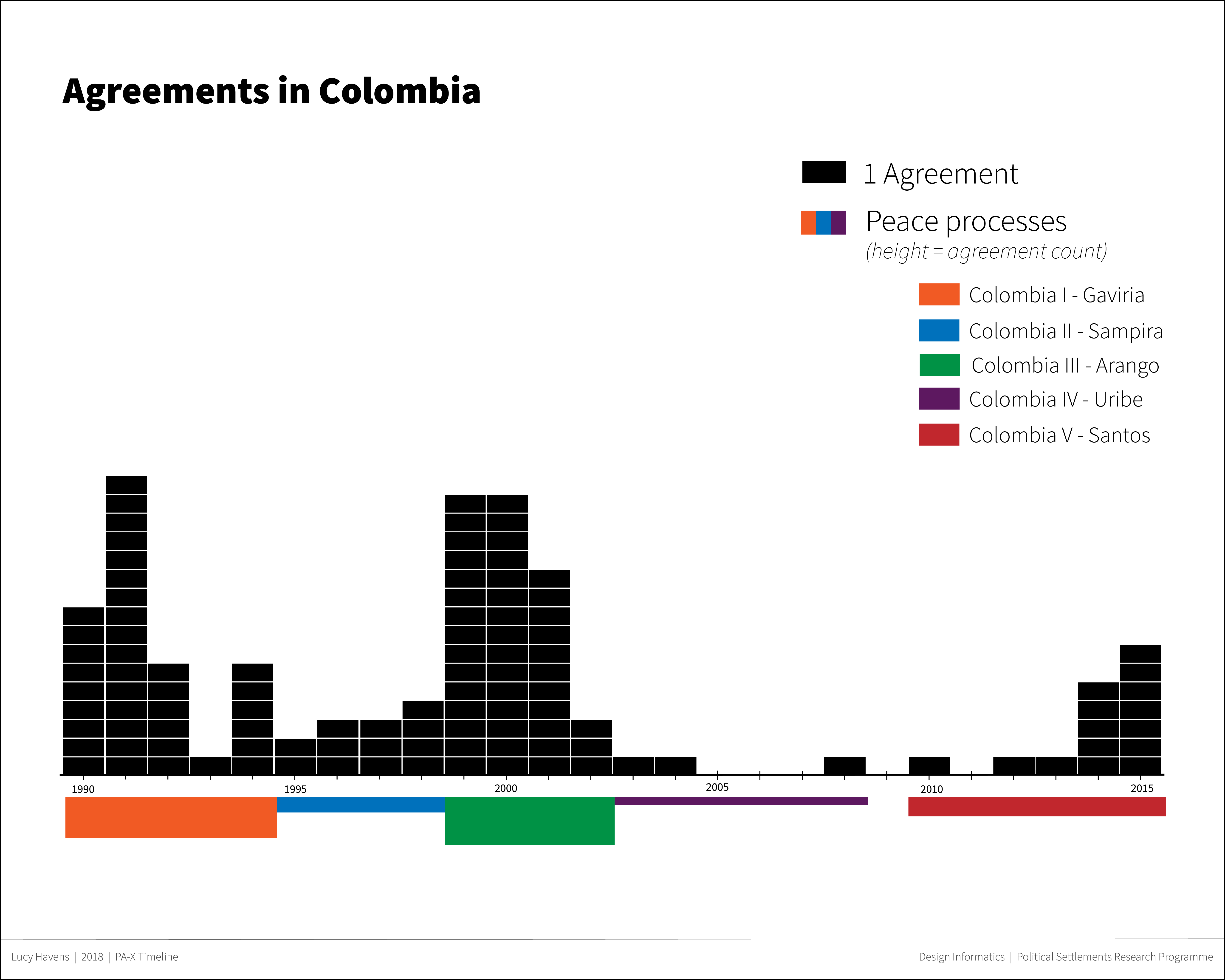


Although people negotiating political settlements may envision an ideal sequencing of agreements, visualizations of Colombia, Yugoslavia (former) and the United Kingdom indicate an inconsistency in the reality of agreements’ sequencing.
Of course, these static visualizations only hint at the types of patterns and comparisons the PA-X Timeline will facilitate. The dynamic version will let researchers to choose the dimensions of data to visualize so they can tailor the timeline to their own research.
Check back at the beginning of August for the next iteration of the PA-X visualization project: an interactive timeline built with D3.js.
This post was written for the PA-X Visualization Project in the Political Settlements Research Programme at the University of Edinburgh (project website: https://paxviz.wordpress.com/)
Leave a Reply